Online Fonts Generator

The advantages of 8 bit font in modern blogs and messengers

The 8-bit arcade font is also called Atari, or Namco. It is basically the Retro Pixel font that is great for gamers and techno style lovers. The field for applying this best font is indeed wide and endless.

It is certainly used more by the older generation since it looks so nostalgic. But teens are loving it too thanks to its funny and positively primitive look, so the target audience can be different.

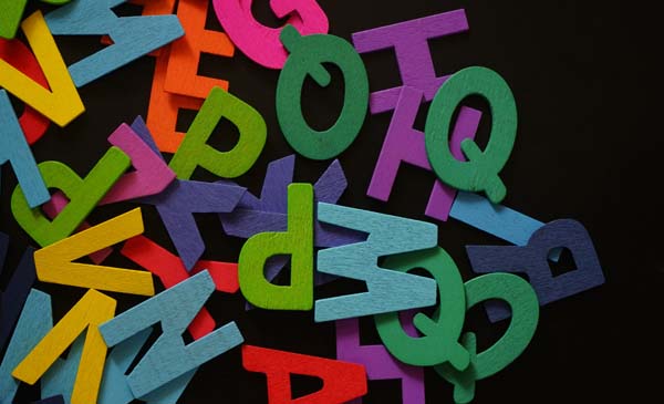
The choice of 8-bit fonts is really impressive today, from the simplest Game Over and Pixel Typeface to more imaginative Berlin Fraktur and Rixel. It depends on the main purpose of the author.

The most creative bloggers who are digging well, can find such pearls as the Determination font that is amusing, awesome, and resembles the unforgettable Mario game style loved by many.8 bit font

With such a wide range of possible typefaces, one can promote any kinds of goods and create any kind of the atmosphere for achieving their goals online. That’s why it’s always the leader.

Just to get the idea, the 8 bit font is totally the best for the fun party promo in group chats and invitation posts, including Birthday celebrations, corporative parties of IT departments, etc.

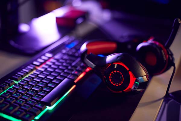
Although online games progressed so much today, the developers and gamers keep on using cool retro fonts like 8-bit in their products and virtual communication. Art designers make the same choice.

Nothing can be better for the college events, amateur music festivals, organized holidays for children and whatever involves a lot of entertainment. Sometimes suitable for the official stuff as well.

It’s the case when the company specialized on technologies, electronics, engineering. Then 8-bit fonts can even be used on the business cards, logos, advertising posters, or commercial offers.

Thrasher font popularity then and now: best choice for bloggers

Thrasher is one of the top leaders among fancy fonts perfect for headings and logos. This name actually comes from the famous skateboarding magazine of the 80’s but the typeface appeared earlier.

It is characterized by thick and massive letters that are slightly asymmetric and intentionally unfinished or interrupted. They are straight and non-cursive, no curves or loops are used for decoration.

With such a strict yet weird shape

Thrasher font might serve video games blogs and various rock style titles the best. It looks great when nicely combined with extra effects, like the fire on the top.

The logos with Trasher letters also traditionally use the curvature shape, resembling the sunrise over the horizon. This font and overall image are super popular among the street culture designers.

Using this unique font style is a must for everyone who reflects the hip hop events or skateboard festivals on their Instagram, FB page, or in personal blogs on WordPress and other modern platforms.Thrasher font

Since it’s so impressive and spectacular

Thrasher font is frequently used for all possible decorative and creative purposes from layouts and backgrounds to the main titles and big poster headings.

Although the primary target of this best font was the hip hop youth, it eventually became the symbol of successful commercial use. It is known this way and continues being used in different areas.

Meanwhile, stylish Thrasher letters are chosen the least frequently in messengers, except for themed greeting cards or skateboard posters and events promo. Mind that if you lead the group chats.

In a way, this cool font indicates a good taste of the person or audience, thanks to its long-time popularity in artistic and freedom-loving circles.Top bloggers take this into account for their business.

The best Gaming fonts for developers and end users worldwide

Due to the huge popularity of video games at all times, hundreds of gaming fonts have been developed and offered to the target audience. Those are surely the most stylish fonts in the market.

It’s interesting but the possible options are too many,to categorize the gaming fonts separately. Any of them are suitable for gamers blogs and forums as long as they look cool and impressive enough.

Medieval gaming fonts

There are lots of medieval styled games on the Internet so the appropriate best fonts are always needed. Goudy, Olde English, Perry Gothic, BlackChancery just to name a few out of the very long list.

It’s surely necessary for top designers and simple users to select fonts awesome of medieval style to keep the inspiration going. It concerns the same themed movies and storytelling as well though.Medieval gaming fonts

Science fiction style

For the most modernized and urbanistic or futuristic games, science fiction fonts are simply the best. They help feel the atmosphere in discussions online, themed blogs and social network groups.

Nebula Sci-Fi font, Alive, EVAA, ASTRON, these and many other techno fonts are totally perfect for experienced gamers and totally reassure the strategic immersion for more qualitative gaming.

Western style fonts

Plenty of games are made in western style and it should affect the chosen fonts as well. Barbaro, CM Old Western, Yatsurano, but most of all, Country Western fonts are so great for this loved theme.

By using the suitable letter styles, gamers and game creators raise the excitement level and express respect towards each others’ interests in gaming. The right font brings special sensations too.

The experts in blogging and playing online never ever underestimate the importance of cool fonts. It’s literally a guarantee of good sales or the victory and popularity in gaming, accordingly.

Surprising things about fancy Latin fonts for the most creative

The Latin alphabet is just too common worldwide so basically thousands of fonts we got used to, can be called Latin. While the Latin American fonts are a separate category interesting to all designers.

Created by Latino artists and bloggers, they respond to the free spirit of this part of the world and its unique brightness. The best fonts like Carioca andMapuche, are colorful enough to attract the attention.

However, the unusual shape means a lot too for being listed in this category. Try the Halbgot and Baires to reach the maximum of originality and uniqueness. The segmented letters look very trendy.

And that’s actually the main goalof Latina fonts, re-creating the most fashionable and trendy atmosphere so typical for Buenos Aires, Brasilia, Santiago, Lima, and other big Latino capital cities.latin fonts

Being proud of their culture and ethnic identity, Latin designers pass this artistic value to the world through very unusual and personalized texting. There aren’t many Latin fonts, but they’re appreciated.

Plus to the impressive headings and text decoration, these best fonts are also great for personal chatting. They look festive enough for composing the very special greeting cards and fun congrats.

It is also becoming more and more common to choose Latin American letter design for business cards and invitations in case the company is connected with the IT field or any particular kind of art.

Gift certificates, Birthday parties, boutiques promotion, all these purposes are served wonderfully with aesthetic Latin fonts and layouts. One is never limited in his imagination when using them.

Since Latin lovers are so famous for their hotness and passion, these fancy fonts are also favourites of romantic messaging and modern wedding blogs. Do not lose this chance to raise the audience.

Top facts about the thick fonts: best tutorial for the beginner

The bold fonts, or thick fonts are letters heavy enough to catch the eye and attract the audience easily. They’re irreplaceable for the logos, headings, titles, posters, and all the loud stuff in promo texts.

Get trendy with Grind

There are dozens of free stylish fonts with thick letters such as Grind, that look extremely stylish and modern. If you’re promoting some trendy products or blogs, such cool fonts are the best for you.

Get sporty with Pulse

Many sportive brands are choosing the massive fonts like Pulse, for announcing their special events and attracting more participants. These huge bold fonts are screaming about the high quality.thick fonts

Get funny with Bjola

There are so many reasons to be entertaining as an author, from writing for kids and their mothers to making a show for adults. In all these cases, funny fonts like Bjolaand Zufohelp a lot.

They’re fancy, imaginative, creative, and well combined with the same style patterns or images. That’s why such funny thick fonts are frequently selected by the top designers and bloggers worldwide.

Get nostalgic with Guster

Hundreds of retro fonts that are very thick and bold, are filling the text market. Guster, Ultra Violent, Pink, Brute are among them. It’s the best way to make your audience feel touched and sentimental.

Get urban and futuristic with Solida

Not many fonts can qualify as futuristic, but Solida certainly can. Other than that, most of the neutral font styles are close to the futuristic impression, for instance, such as Horizon, Integral, Haus, Torch.

Being in between the classical and contemporary style, these thick fonts are creating the unique atmosphere in their own way, and form the most attractive atmosphere for the folks’ modern blogging.

Top reasons to use the Rock font style and be original

There’s no better way to look cool than using the rock font. There are basically two main types of the rock fonts but both of them look great for designers and most progressive bloggers.

Rock Stone fonts

These typefaces are really modern since they belong to the group of 3D fonts. They vary from the natural grey stone color to the black graphite. In the last case, they may look brush-drawn.

The cracked letters or shadowed ones look especially stylish and therefore are in high demand. They’re great for headings, titles, group or company names and other considerable words.

The street culture fits perfectly for this font so it is used actively by the young top bloggers and journalists enlightening the teenage life. It’s so perfect for the posters and T-shirt texts.

The same come to tattoos, but one should know the Rock Stone font is a bit less popular for tattooing than Gothic and Medieval letters. Yet, lots of people chose exactly this style.

Rock Music fonts

The letters in this style can be close to the Gothic or Retro fonts. In any case, they’re greatly loved by all creative and brave authors who aren’t afraid to express themselves fully.

Rock fonts aren’t the most extreme or trendy ones, they can be used for the moderate topics as well. Any announcement, news, the cultural event promotion, musical blogs are suitable.

Still, the Rock fonts are somewhat too heavy for chats and messengers. They aren’t fancy enough to decorate the greeting card or business invitation, so they remain in the neutral zone of messaging.

At the same time, exactly Rock style letters are considered the most universal when it comes to the age category. Anyone may like the rock music and accessories, so anyone can use this best font.

The most surprising Rockstar font: which needs it serves?

What can be possibly cooler than Rockstar font, as more as it has many different stylish typefaces? Just look how much space for the imagination it leaves, especially for the young designers.

Gothic Retro style

Of course, Rock style letters are mostly associated with the Gothic retro patterns. They’re irresistible when choosing the tattoo look or making the headings for the rock music blog, for instance.

Brush-written rock fonts

It isn’t rare that Rock typefaces are cursive and brush-imitating. It gives them especially artistic look and makes them a bit refined, so they can be used in various greetings and romantic messages.Rockstar font

Rockstar alphabet

When the alphabet is in Rock style, the letters look big, retro-shaped, and fancy. The name of the fonts itself suggests the celebrity looks and atmosphere, and it’s indeed the most elegant font in its way.

Graffiti Rockstar

It’s just logical that Rockstar style can be depicted as the Graffiti letters. The Rockstar Burger font and similar ones are extremely impressive and bold. They’re traditionally good for posters and logos.

Vintage Rockstar

There are several types of vintage Rockstar fonts. They can be very plain old-style retro, just like on the street signs in the 60s. Or, they can be curly and flowery yet keeping the Rock style impression.

Thin Handwriting Rockstar

There will always be the need in more refined fonts, even if they’re Rock styled. The Rockstar font can be pretty thin and handwriting imitating, which is great for greeting cards and business invitations.

It would be short-minded to think that Rock sphere isn’t commercial. On the opposite, the big money can be made by the producers and musicians themselves, that’s why the fonts should vary that much.

Top use of the Western style font and profitable consequences

Western fonts are one of the retro letter categories. They somewhat differ from other retro typefaces though, and exactly resemble the cowboy style patterns and overall atmosphere.

Why would one choose them in modern life then? First, Western fonts are perfect for impressive headings and advertising posters. They also look great on the skin as the tattoo elements.

The difference between western alphabets is only slightthough, since they would lose their themed pattern otherwise. They may only differ in coloring and thickness, the shadow effects, etc.

Specialists highly recommend Western fonts for catching the audience’s attention quickly. They accompany the best such products and gifts as the craft food and the cowboy-styled handmade.recommend Western fonts

No wonder many manufacturers and artists prefer exactly this category of fonts for the gift certificates, postcards, Instagram posts, all kinds of online and offline promotions and decorations.

The baby boomers and older generation adore the Western letters, which allows to use them in virtual newspapers and forums for this target audience. Designers love these cool fonts at all times too.

One little hint for commercial use, western fonts are created for expressing and serving the true masculinity. Therefore, any goods and items meant for alpha males or their fans, may need this font style.

Colognes, underwear, sportive stuff, energetic drinks and such, should be promoted exactly with Western lettering and symbols. It guarantees the best result and most successful outcome at the end.

It doesn’t make sense to use them for ultra-modern and urbanistic products though, including the online magazines for men and contemporary culture events. There are more suitable cool fonts for that.

All areas that aren’t connected with the high-tech style, are compatible with Western fonts and can potentially profit from them a lot.

Where to use the ethnic Rune fonts for a better success

The Runic font will just never lose its popularity, due to a big number of fantasy genre fans and themed video games. It is also called Elvish font, Viking Alphabet font, and similar names.

The esoteric lovers and practicers are also active users of Rune letters on generators and keyboards online. They do design their sites, blogs, and social network pages with these ethnic fonts.

Hobbiton and Tolkien runes

There are many kinds of fonts named after the Hobbit characters, such as Bilbo Hand, Elvish Ring, and so on. They are greatly used by the gamers and cosplay lovers in their personal blogs.

Tolkien fonts also have a big commercial potential, with the possibility to advertise the themed jewelry and items. For instance, those super popular Elvish earrings that make the ear look longer.ethnic fonts

Nordic and Viking fonts

The ancient origin of the runes is Scandinavian and German. It’s no surprise many rune typefaces are called Nordic or Viking. They look ethnic and retro-styled yet strict and mysterious enough.

Accordingly, such cool fonts are often used by historic and esoteric bloggers, avid travelers, researchers of Scandinavian culture. There are many alternatives on how such fonts can look visually.

Modern and Fantasy fonts

The specific trait of modern Runic and Fantasy typefaces is that they look extremely stylish and designable. Those are rather cool fonts which can be used with the decorative or artistic purposes.

For example, Mara’s Eye is super ethnic and trendy, would go great with the 3D animation or T-shirt patterns. While Skyrim Daedra could be the best solution for tattoo texts and other artworks.

Hieroglyph Rune fonts

Of course, the ancient Runes were all hand-written. Some developers are using this fact for creating the more realistic shape of their fonts, making them look like ethnic hieroglyphs.

The history and modern purposes: where to use the Italic font

It may seem to us we know everything about classical fonts, but then the facts come that really surprise us. Did you know why Italic font is called like that and where it was invented?

Like its name says, it was firstly designed in Italy, to replace the handwriting style in books and papers. But later all European and western typographies adopted this nice decorative font as well.

Today, Italic font isn’t just for a decoration or calligraphy imitating. It’s an official tool for composing business papers, scientific papers, and any creative works that should look decently.classic fonts

  • APA style. Students know how important Italic font is for their works. They should italicize the titles of books, reports, webpages, as well as all types of periodicals.
  • Titles in blogging. Despite the big variety of classic fonts, professional bloggers often use exactly Italic fonts for the titles and subheadings. It’s visually aesthetic and cool.
  • Dialogues and direct speech. Italics are traditionally used for indicating the dialogues or, let’s say, users’ brief success stories or shared memories. It’s quite convenient.
  • Focusing on smth. While chatting on Whatsapp and in other messengers, we want to focus a person’s attention on smth. Bold fonts are too intense, but Italic are perfect.
  • Tattoo texts. Although less popular in this area, special Italic styles are used in tattoo patterns and saloon advertising. Especially Monotype Baskerville and Maryleen FY.
  • Newpaper-styled blogs. Italic fonts are so perfect for stylized news, many bloggers use them for creating such an atmosphere. It’s rather an old London and Paris style.
  • Being romantic. For the beginners who create greeting cards and other sweet signs of attention for their loveys, most of Italic fonts are a long-searched solution.